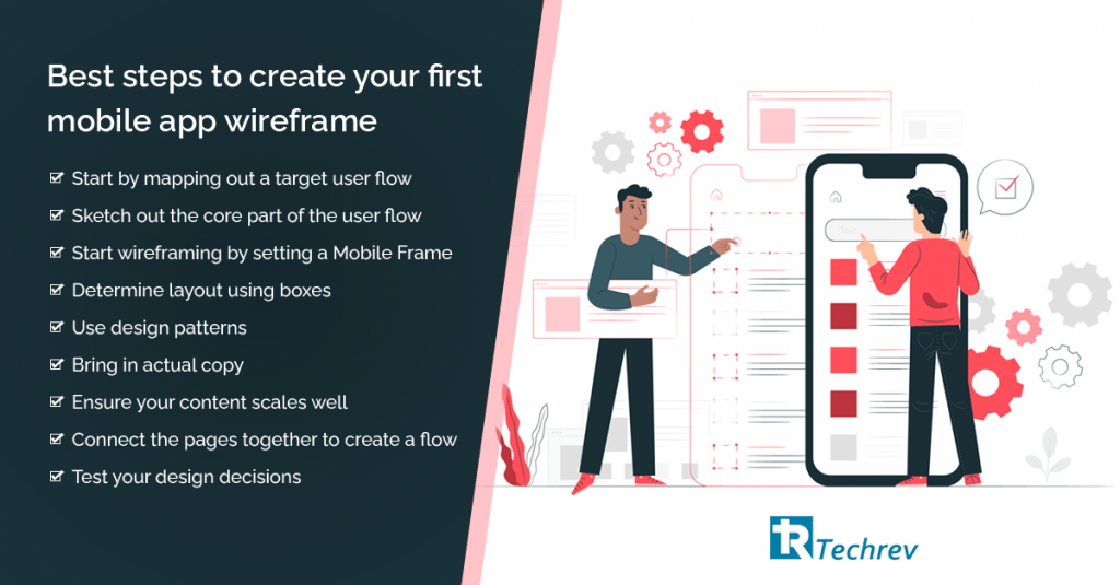
The wireframe is the first impression of a mobile app. And in most of the pitches, wireframes can make or break the deal. Wireframes are considered the core leaders of functionality. It ensures that your entrepreneurial dream becomes a high ROI reality. But hold on, let’s start with the basics.
What is a wireframe?
It is a foundational step toward building a compelling UI/UX. A wireframe is a visual representation of the individual elements included by the application or the website. Usually, wireframes are created in black and white, but that is not a limitation. It can be physical, digital, hand-drawn and also created in 3D.

What’s the need for a wireframe?
Wireframes are more than just the first impression. It’s important to portray the function and communication of the building app. It directly translates as the blueprint. The need to create the wireframe arises at the very beginning of the design process and takes much less time than creating mockups. Mockups include accurate color palettes, images & also content. Wireframes on the other hand are only to present the navigation, look and feel & hollow structure of the app.
Fun fact: Wireframing is also known as ‘paper prototyping’ because of its color & line illustration.
The role of a prototype or wireframe comes into the picture right after you establish the why, how & where of the application. Whether you prefer to prototype a wireframe digitally or on paper, it’s just personal preference. Most importantly it significantly lessens any misunderstanding of verbal communication between developers. After all, this is a brainchild of yours, who would know better than you?
We’ll directly plunge into understanding how to get started, read on to know more.
1. Wireframe is your brainchild. Don’t forget to be descriptive
For instance, let’s take the example of an under-construction complex. Without a blueprint, the builders would be as lost like a needle in a haystack. The builders won’t have any idea how many floors to add or where to place the electrical outlets, plumbing or even doorways. If you are only offering the builders the references of other designs and expect them to work in unison toward a common unanimous goal, the chances of project completion are one in a million.
When it comes to building applications, without a detailed wireframe and technical know-how, the designers won’t know how to navigate the menus or layout. The more descriptive you are, the better. The blueprint and descriptions are the mirrors of your vision. Make sure to include all the information correctly. From functions of the screen to page buttons, the wireframe will lead the designers to create mockups.
Also read: 9 Custom App Development Trends to watch in 2021
2. Don’t be bland
Hi-Fi or high-fidelity wireframing is the way to go. It not only translates the structure of the app but also the colors, tones and page structures. It does a better job of visualization for you as compared to the B/W low-fi sketch. Don’t forget this can either be time well spent or time-wasted. The pitfall is that designers might end up just wasting time and creativity. On the other hand, the positive side is that designers have to rely less on their imagination if the product aligns with the vision.

3. Wireframe should be interactive
Don’t let any page or navigation lead to a dead-end, especially any island page. Hence, go over all the wireframes to make sure all functions have a respective landing page as intended screens. This also includes creating possible error messages such as ‘incorrect password’.
Making your static designs interactive is probably the best thing that can happen to your wireframe. It is extremely beneficial, as it enables the first user to engage with a clickable mockup of the app. Our favorite tools are – Invision, Marvel and Figma.
Also read: 5 Common Mistakes to Avoid in Making a Mockups
4. Share your inspiration
In case you have any particular inspiration or a similar app in mind, add it in the wireframe descriptions. Because if your developers or designers know the user experience, emotional feel and the things you are inspired from, it will help them understand the intended outcome more effectively.
To translate your dream for designers and developers is vital. That’s why you need to make sure you follow all the above pointers. This stage is where you see the app before all its glamor, body and flesh. If you point your ship in the intended direction, the destination is almost promised. For more information and expert guidance, feel free to reach out to the TechRev team. Watch out for this space for additional interesting information.
