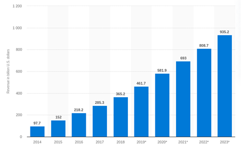
Did you know 2020 recorded more than 3.5 billion smartphone users across the world? The industry is expected to generate revenue of approximately 582 billion USD. Clearly, smartphones are becoming staples in our lives, thanks to the engaging apps, handy solutions & many more interactions that are easier with a smartphone.
Individuals rely on apps for various activities, starting from alarms to wake them up in the morning to connecting with friends and sending work emails. This might make you think that developing an app is the next big thing, but it’s not always the case.

If you want to develop an app for a truly unique idea that you have, it’s imperative to deliver an optimum experience to your users. With the increasing competition, make sure you are providing them seamless navigation and effortless functionality through your app. However, in all the rush, developers tend to overlook some of the features that should not be missed. Here are aspects you should keep in mind while developing your app.
Also read: What compels a user to uninstall your app?
1. UX Platform Compatibility
Don’t forget that your app does not function all on its own. Different applications and features make up a smartphone. Hence, you must make sure to design an app that works seamlessly with other features on the device. For instance, if you are creating a social networking application, then such apps will make use of geolocation, data network and your mobile data integration. If your app provides limitations to work seamlessly with other features, it’s most likely to fail.
Speaking of compatibility with the features, you must also ensure the app is ideally responsive on different screen sizes as well.
2. UI/UX Interface
One of the important things about the most popular apps of today is the simple interface. Users must be able to navigate through the app quickly and effortlessly. You must remember that no matter which application you build, or what service it provides, consumers of today live a fast-paced lifestyle. Challenges like these require a seamless interaction to become one of the bestselling apps in the market.
Do you remember the last time you used an app with complicated navigation? Pretty sure you abandoned that app very soon. Hence, rethink the features and gauge whether the navigation and features serve a purpose. Take Netflix for example, the app excels due to its navigation and interface. It categorizes your genres, types of films and features the top ones on the homepage. This helps in maintaining simplicity and does not compromise on functionality.
3. Rat race
If you want to ace, you need to get out of the rat race. Just like any other industry, if you want your app to differentiate itself from competitors, merely copying your rivals will not be enough. Take a quick glance and analyze the SWOT (Strengths Weakness Opportunities Threats) to understand what you can do about redesigning. If you fail to differentiate your app, you will surely be lost in the crowd. Simply highlight your uniqueness even in the UX and let your audience recognize you.
4. Spam notifications
When it comes to reminders, updates or inviting users, most apps blur the lines between being pleasant and spammy. In the US, an average smartphone user received at least 46 push notifications a day and 31% of the users don’t find them useful. It’s mutually understandable that too many notifications are not liked by anyone. That’s why you must strive to bring a balance between not being spammy as compared to abandoning your user. You don’t have to send random news via push notifications, you can simply tell them about useful new features and their usage.
5. Feedback
Testing the app on a limited set of audiences can only get you so far. But once your app is launched, you’ll receive feedback from your target audience. The app’s UX doesn’t have to be concrete and not open to change, but you can modify a few things as per the user feedback. Always remember that your users have better judgment of the functionality of the app than your app developers. After all, a genuine response cannot come from a simulated environment. Let them tell you what works and what doesn’t.
Take Instagram for example – the app updates its UI/UX faster than any other app based on customer feedback. There’s a reason it looks different today as compared to when it launched. The team paid attention to their customers’ concerns and regularly updated the app accordingly.
To stay updated on the latest trends in app development, watch out for this space. TechRev can help you navigate your way through these tricky situations, so keep us in mind when you’re in need of assistance.
